Saber em Rede | Brand (2020)
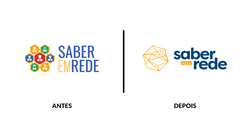
Right before designing the new UI, I had the opportunity to update the branding for Saber em Rede. In order to do so, the team brainstormed the basic concepts and I worked on the design, translating the ideas into a simple, friendly and memorable structure. Part of the plan was to make sure both the original Hexagon connections were present and also making sure we could break it down into different products according to future needs (such as what happened with the Hub product) with seriousness but friendliness.
 One of the main needs for this brand was expanding the startup from the higher education field to other areas. The main term for that was the word rede, network.
The final proposal renewed colors with more sober, intense tones and keeping the Connection aspects to the symbol.
